3 Ways to Fine-tune Presentational Components
Here are three ways to make React presentational components work as re-usable building blocks.
Experiment with a storybook
With Storybook, you can create a gallery of examples for your components. If a component works in Storybook, chances are it will keep working no matter what else you place around it.
Storybook calls each example a ‘story’.
Once you’ve got Storybook installed, you add stories in JavaScript with the help of the Storybook storiesOf function. Here are two stories for a text input component: the first shows the component in its valid state, and the second show the component in its invalid state.
import React from 'react';
import { storiesOf } from '@storybook/react';

storiesOf('Input', module)
  .add('valid', () => <Input name="name" label="Name" id="name" />)
  .add('invalid', () => (
    <Input name="name" label="Name" id="name" required />
  ));
The storybook command line tool creates a set of webpages where you can explore your components in action:
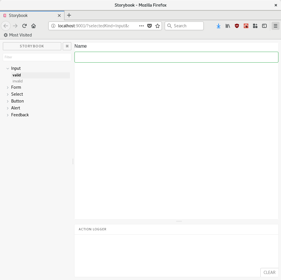
Now you don’t need to navigate to specific pages of your application to inspect a component in different states. It’s all in the storybook.
Unbundle UI elements
It’s better to create small components with shallow hierarchies.
Suppose we want to add an error message to our input element. You could create an errorMessage prop and an invalid prop to tell the Input fit it finds itself in an invalid state:
<Input errorMessage="Please fill the name" invalid={invalidInput}/>
But it’s not immediately clear how the props work and the relationship between the invalid state and the error message is hard-coded. That’s a problem: logic is supposed to live outside presentational components!
Instead, extract a new component and pull it up:
 <Input label="Name" id="name" name="name" />
 { invalidInput &&
 <Feedback>Please fill the name</Feedback>
 }
Let the container decide explicitly when and where show presentational components.
Keep native props working
As you keep pulling presentational components up, they start looking like enhanced native elements, so you’d like to be able to pass all props you would pass to a native element, like onClick or onBlur.
Inside the component, extract the props you’ve defined yourself and pass the rest to the element that you’re wrapping:
export default function Input({ label, ...inputProps }) {
  return (
    <React.Fragment>
      <label htmlFor={inputProps.id}>{label}</label>
      <input className="form-control" {...inputProps} />
    </React.Fragment>
  );
}
Here, we’re separating the label prop from the rest, and passing the remaining props to the <input> element.
Destructuring and object spread properties let you write this concisely.
Further reading
For an introduction to React fundamentals, take a look at React for Real. The components in this article ended up fairly similar to Reactstrap; it could be a handy project if you need some React components with the Bootstrap classes applied.